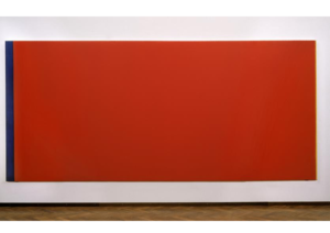
In the late 1980s, a visitor named Gerard Jan van Bladeren entered the Stedelijk Museum in Amsterdam and stood before Barnett Newman’s massive painting, Who’s Afraid of Red, Yellow, and Blue III.

Color psychology connects colors with emotions and behavior. It reveals how color affects your moods and can even be incorporated into your wellness routines.
The canvas, almost 18 feet wide, featured two thin strips of blue and yellow on either side but was dominated by an overwhelming sea of bright, provocative red.
The sheer intensity of the color incited a visceral reaction in Bladeren—he felt so moved by the painting that he pulled out a knife and slashed the canvas, later explaining that it had made him feel “provoked” in a way that no other art had before.
While this may be an extreme example, it highlights a fascinating truth: colors possess the power to deeply affect human emotion and perception.
Whether it evokes calmness, aggression, excitement, or discomfort, color has a unique psychological impact on us beyond mere preference. In marketing, this same influence plays a crucial role in shaping consumer choices.
From the branding that makes us feel drawn to a product on a supermarket shelf to the colors that prompt us to click on a website, the shades we encounter subtly drive our behaviours.
Brands, keen on harnessing this invisible power, meticulously select color schemes to shape their visual identity and create emotional connections with their audience.
Read on to discover how color psychology shapes marketing, and how choosing the right color can make your brand stand out in a crowded marketplace.
What is Color Psychology?
Color psychology connects colors with emotions and behavior. It reveals how color affects your moods and can even be incorporated into your wellness routines.
In 1810, Johann Wolfgang von Goethe published The Theory of Colors. An important work that linked colors with emotions, opening the door for modern color psychology.
In the 1940s, the connection between people and colors was taken even further with the work of K. Goldstein and others. These connections were developed into the practices of art therapy and color therapy.
Beyond color therapy, color psychology extends to advertising and marketing. Branding and product design decisions are made based on how people respond to certain colors.
Why Colors Matter in Marketing?
For marketers, color is far more than an aesthetic choice; it’s a vital aspect of branding and consumer influence. Research reveals that up to 90% of snap judgments about products are based on color alone.
This makes the selection of a brand’s color palette critical for creating lasting emotional connections with the audience.
Moreover, 85% of consumers say color is the primary factor that drives their purchase decisions. The right color not only builds brand recognition (boosted by as much as 80% due to color ) but also fosters consumer loyalty by reflecting values and emotions.
Colors also play a key role in creating environments that influence decision-making, from product packaging to digital experiences. The science of color psychology gives brands the ability to influence consumer behavior and preferences in impactful ways.
How to Choose the Right Color for Your Brand
Selecting the perfect color for your brand is a subtle yet powerful decision. It’s not just about creating an aesthetic appeal but about influencing how people perceive your brand and the emotions it evokes.
Understand Your Audience
Your brand’s color should reflect the preferences, cultural nuances, and expectations of your target audience. Color psychology reveals that certain shades evoke specific emotions across different demographics.
For example, red conveys love and excitement to 68% of people, while orange brings joy to 44%. These insights are vital when considering how your audience will resonate with your brand’s visual identity.
Coca-Cola, with its striking red branding, immediately taps into emotions of energy and passion. This helps them connect with a global audience, who associate the color with excitement.
Understanding what drives your audience’s emotional response can shape how they feel about your product and brand.
If you’re aiming to connect with a more calm, eco-conscious audience, for instance, green, which brings a sense of contentment to 39% of people, might be more effective. Knowing your audience’s preferences helps you align your brand color to their emotional landscape, deepening your connection with them.
Tip: Conduct surveys or leverage data to discover your audience’s emotional responses to certain colors. This can be especially valuable if you’re entering new markets or launching new products.
Define Your Brand’s Personality
Colors are an extension of your brand’s personality, and they should reflect the core values and message you wish to communicate. Whether your brand is playful, innovative, or formal, the right color will reinforce this identity.
Slack, for example, uses a playful combination of colors in its branding to reflect its collaborative and user-friendly platform, appealing to creative teams and startups.
On the other hand, IBM opts for a classic blue, a color that brings relief to 35% of people and is associated with trust, professionalism, and stability—perfectly aligning with their image as a reliable tech giant.
Here’s how some popular colors reflect personality:
Red: Passionate and bold.
Blue: Trustworthy and calm.
Green: Balanced and eco-friendly.
Yellow: Joyful and optimistic (connecting to 52% of people).
For brands that focus on wellness, such as Lush, the use of green signifies a connection to nature, reflecting their eco-conscious values. Their choice to pair it with black adds sophistication, balancing earthiness with a premium feel.
Tip: To match your color to your brand’s personality, ask yourself: Is my brand playful or formal? Futuristic or traditional? Tech-driven or nature-focused? Use this to drive your decision-making.
Consider the Industry
Certain industries tend to favor specific colors due to the emotional associations consumers have with them.
For instance, blue is commonly used in tech, healthcare, and finance because of its association with trust and security. Brands like Facebook, Twitter, and Intel have capitalized on this, using blue to convey reliability and professionalism.
Green, associated with contentment and health, is the go-to choice for environmental and wellness brands, such as Whole Foods and John Deere.
However, standing out in your industry doesn’t always mean sticking to convention. T-Mobile breaks from the telecom industry’s standard use of blue and red, opting instead for a vibrant magenta.
This bold move sets them apart as a dynamic, energetic, and youthful brand, resonating with a younger, more adventurous audience.
Similarly, red—which brings a sense of love and passion to 68% of people—works well in food industries (like McDonald’s) to stimulate appetite and excitement. However, red also brings intensity, making it less suitable for industries like healthcare, where calmness is preferred.
Tip: Research your industry’s color trends but also think about how you can differentiate your brand through color while still staying aligned with consumer expectations.
Partner with Pichkaari to Build Your Brand Identity
Choosing the right color is just the beginning. To create a lasting brand that resonates with your audience and evolves into a cultural icon, you need more than just color psychology—you need a holistic approach to brand building.
That’s where Pichkaari comes in. As a mature integrated communication agency, Pichkaari doesn’t just help you pick colors; we live your brand.
From defining your brand’s personality to creating visual identities that speak directly to your audience, we build brands that transform from corporate identities into people’s brands.


